Fuji Weekly Portra Vs Portra
My first blog post on the website, the main plan here is to essentially have a written version of the videos that i create, and so with that lets kick off with one of my favourite videos the year, comparing the Fuji-Weekly Portra recipe and real Kodak Portra 400 film.
The two cameras that i used on this test were the Leica M6 and the Fujifilm X100V. Two cameras that i have come to love over the past 12 months. I have also created two other videos around a similar concept comparing the fujifilm simulations built into the cameras, specifically Velvia and Acros. You’ll find the links towards the end of the page.


The rules
First up with comparisons like this i think its important to understand my approach and therefore in some ways where there are potentially downfalls in terms of accuracy, because at the end of the day I’m also looking to have fun and generally i do not aim for absolute perfection.
So lets start with the Fuji X100V. I was using the camera with the 28mm wide angle converter. This is to mathc the focal length of the lens i was using on the Leica M6. It should give all the images the same focal length, although potentially slightly different framing. When it comes to which reciepe i used it was fuji weekly’s Portra V2 which consist of the below.
Dynamic range: 400
Film simulation: Classic Chrome
Grain effect: Strong/Small
Color chrome effect: Strong
Color chrome FX blue: weak
White balance: 5200k (r:1 b:-6).
Tone curve: H: 0 S: -2
Color: +2
Sharpness: -2
Noise Reduction: -4
Clarity: -2
If you haven’t checked out the fuji weekly website then you really should! its a great resource for building essentially presets into your camera! And i absolutely love using them.
In terms of the film camera as I’ve said it was my Leica M6 equiped with my 28mm Voigtlander Ultron. This is a combination that I currently cant get enough of, i love the results of this lens.
When it comes to developing and scanning this is where the waters get muddied a little and your results will more than likely vary. I develop all of my colour negative film myself using Cinestill chemicals, i find that i get very consistent results this way, typically more consistent than my local lab. Scanning wise i use my Epson v600 and then use Negative lab pro to convert my negatives to positives. I then tweak these slightly in lightroom. For this test I have tweaked a couple of exposures and used Lightroom CC auto colour balance to balance the images.
Each step of this process contains a mixture of personal, digital and chemical interpretation of the film. If you developed using different chemicals, or scanned with a camera, orconverted with different software then... your images will look different.


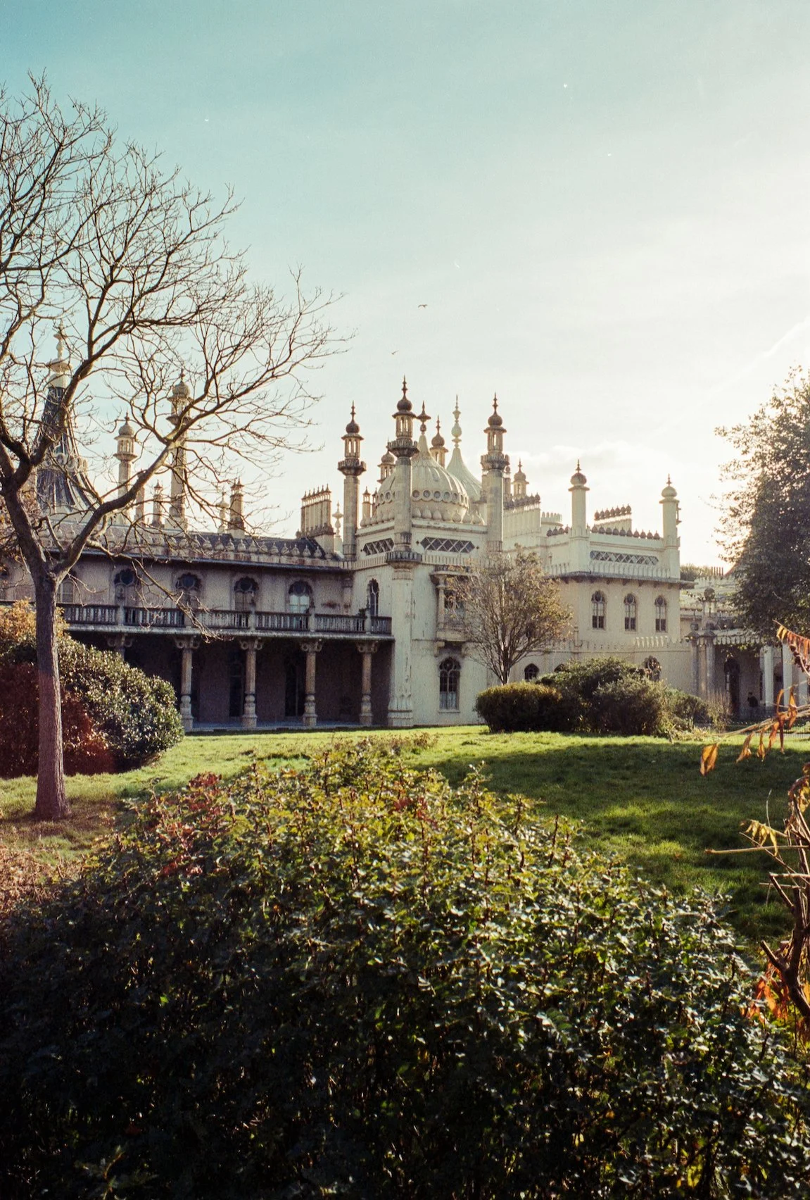
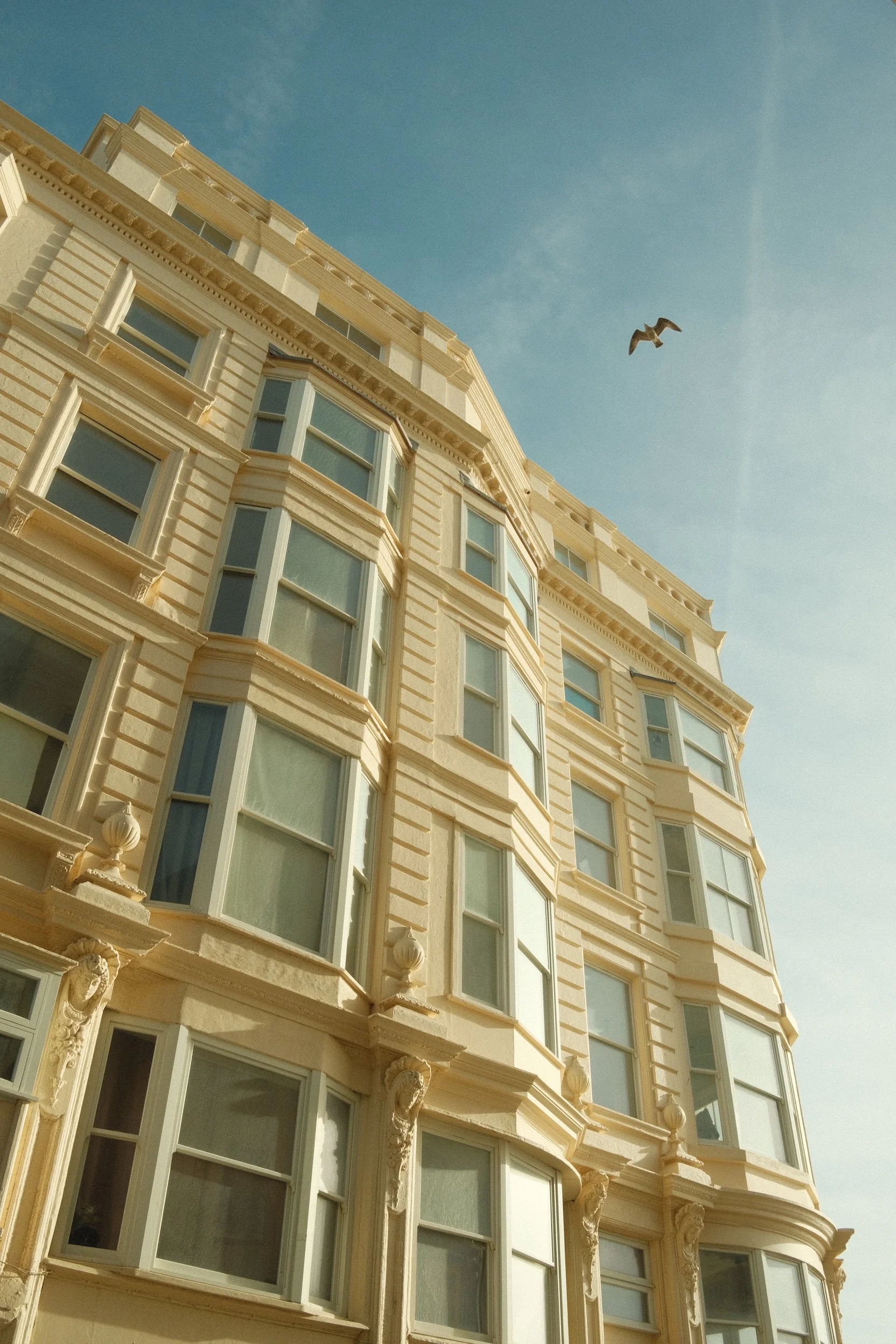
The Trip
In terms of location Clare and I took a walk down the Brighton coastline in honestly some of the best weather of the year. This day was had more sunshine that all of August.... which is pretty good for late October. This walk, and the image taken this day is honestly one of the highlights of my year. And importantly I had been waiting for a sunny day to create this video! I've always felt film especially Portra always perform best in good light! I also think this is very true of the fuji weekly reciepes too! Where they generally have a fixed colour balance as part of the reciepe in the same way that film does.
Colour Balance
Now i think first up.. we should talk about colour balance difference between the images. As it stands out across the board as one of the biggest differences between the two. And well... its a difficult subject. I find that the Portra V2 recipe comes with a strong green tint. Which to be fair is a look that is often associated with film! But... generally to my eyes and with my process not with Portra. Green is typically a more Fujifilm look, with Portra swaying to a warmer colour palette.

If we look at the colour balance from the recipe its:
White balance: 5200k (Red:1 Blue:-6).
Breaking this down into parts, the 5200k is a very white daylight setting. So this in theory matches the bright sunny day that we had. This then suggests that any tint or balance setting are not coming from here
Therefore the look is coming more from the offset settings and the somewhat large -6 blue setting. Here’s a rather boring image from my garden with the -6 setting reduced, and you can see changing it removes some of the extent of the tint.
Now what is interesting is this setting is one of the big differences between v1 and v2 of the recipe from the Fuji weekly website. The old v1 recipe had the following
White balance: Daylight (R: 3, B: -5)
Which from my experience lends itself towards a closer match to the real film.

Dynamic Range and Tone Curve
Next up lets take a little look at the dynamic range of the images the recipe tone curve setting is.
Tone curve: H: 0 S: -2
Highlights have been left untouched which is always think is a good idea with these recipes, let the photographer worry about them by using exposure, and the -2 on the shadows is doing the classic crushing of the shadows which for film i generally think is always a good idea to try and achieve the film look.
The dynamic range setting of 400 also helps add some extra dynamic range to the image. If you’re unaware fuji does this by purposely under exposing the image to protect the highlights and then raises up the shadows a little to add some extra detail there. Many people do the same when shooting raw, you generally under expose to protect the highlights and then brighten a little in post.
This again i think really does help match that film effect. It also forces the camera to shoot up a little from its base iso so we likely get slightly more grain in there too.
I think overall from a dynamic range point of view the recipe might be a little too strong. I think generally the film has slight darker shadows and slightly brighter highlights. But there’s a setting further down the page that i would change instead of either of these.


Other settings
Lets quick run through some of the other settings...
Color: +2
This setting is adding a boost of saturation and tbh if anything i might consider adding just a little bit more, but its very close! Saturation is generally a pretty good match
Sharpness: -2
Having the sharpness setting at -2 definitely helps try and hide the digital sharpness of the x100v. The X100v has a very good lens and one of the big pros ive found with it, is the exceptional sharpness especially wide open.


Noise Reduction: -4
Having the noise reduction on -4 helps add some noise and grain back into the images, which again is the right idea when you want to emulate film.
Clarity: -2
This also adds into the flattening effect that the tone curve did.. which previously i said i feel is a little too strong. I would consider putting this back to 0. And this would also stop the delay when taking images that the clarity setting causes! Win win!


But...
But.... does any of this really matter. Hear me out.
When fuji weekly set out to create this Portra 400 receipe were they really looking to create the closest look they could get to the real thing? Its hard to know, maybe! but i think its far more likely that this is am emulation that is inspired by Portra rather than trying to be technically perfect.
Does this image, at a glance, look like it could have been take on film. To me, without diving into it... yes it does! especially at social media sharing resolutions.
And I'm pointing this out, because this recepie along with the kodachrome reciepe are by far my most used when it comes to colour. And it absolutely love using them. Do i really care that im not getting exactly the same as i would when i shot film. Not at all, I'd just shoot film. But i am extremely happy about the fact that i can program a reasonably convincing film look into my camera.
Which combined with the app for sending images to your phone means i frequently post images that never touched lightroom!


My tweaks
Having made this video what i am going to do is tweak the settings a little, im not sure on the results yet as i haven't fully tested them but i am trying this:
Dynamic range: 400
Film simulation: Classic Chrome
Grain effect: Strong/Small
Color chrome effect: Strong
Color chrome FX blue: weak
White balance: 5200k (r:2 b:-4).
Tone curve: H: 0 S: -2
Color: +3
Sharpness: -4
Noise Reduction: -4
Clarity: 0


outro
This walk was honestly on of the highlights of this year when i look back at it. I absolutely love some of the images! and the weather and company made it incredible!
If you've tried the recipe id be really interested to know your thoughts!
If you havent already! and its also not your first time on the channel then please consider subscribing!
And if you want to see more of these I've linked the Velvia and Acros video down in the description! thank you for watching! and hopefully